
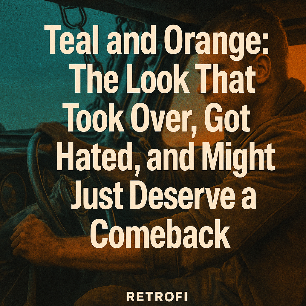
Teal and Orange: The Look That Took Over, Got Hated, and Might Just Deserve a Comeback
Share
In the mid-2010s, there was one look that dominated everything. From Hollywood blockbusters to wedding videos, travel vlogs to short films, one color grade ruled them all: teal and orange. You saw it in movie theaters, on YouTube, in commercials, even in Instagram filters. It was punchy. It was stylized. It made skin tones pop like never before. And then it got torn apart.
It became a meme. A cliché. A visual punchline. The phrase “teal and orange” started showing up in YouTube rants and Reddit threads. Suddenly, anyone still using it was seen as unoriginal or stuck in the past.
But here’s the question. Was teal and orange ever actually a bad look? Or did we just see too much of it?
Let’s break it down.
The Rise: Why Teal and Orange Took Over
1. It Was Never Random
Teal and orange are complementary. They sit opposite each other on the color wheel. That’s color theory 101. When you pair them together, your image gets natural contrast and harmony. Skin tones sit in the orange range. Backgrounds and shadows often fall into blue or teal. So you get separation. You get focus. Your subject pops.
It worked in every situation. Interiors. Exteriors. Day. Night. The combo was flexible and flattering. Which made it irresistible.
2. Hollywood Loved It
Blockbusters led the charge. Look at:
-
Transformers
-
Iron Man
-
Pirates of the Caribbean
-
Mad Max: Fury Road
-
Tron: Legacy
-
Oblivion
These films didn’t just use teal and orange. They leaned all the way in. The shadows were cold. The skin tones were warm. The world felt dramatic, enhanced, surreal but believable. It felt big.
Once Hollywood made it a signature, the rest of the world followed.
3. Everyone Could Finally Do It
Color grading used to be reserved for post houses with $300,000 suites. But around 2015 to 2016, that changed. Software like DaVinci Resolve became free. Plugins got better. LUT packs exploded. Suddenly, anyone could grab a teal and orange LUT, drop it on a clip, and feel like they were making something cinematic.
And they were. Until they weren’t.
The Fall: Why Everyone Turned On It
1. It Got Lazy
At first, people used teal and orange as a style. Then it became a default. It was no longer a creative decision. It was a preset. Drop it on. Done.
Worse, people started applying it to footage that didn’t fit. Documentary interviews. Nature walks. Anything and everything. The look became generic. Instead of adding flavor, it started flattening everything.
2. Internet Backlash Hit Hard
YouTube video essays began calling it out. Reddit threads mocked it. Blog posts dissected it.
Titles like “Why Teal and Orange Is Ruining Movies” started trending. Screenshots of graded frames were compared side by side, all looking nearly identical. Filmmakers and colorists started avoiding it out of fear they’d be grouped with amateurs.
Once something gets labeled lazy or overdone, it’s hard to redeem it.
So Was It Actually a Bad Look?
No. The look itself never sucked. The problem wasn’t the style. The problem was the copy-paste mentality.
Every grading choice needs context. Teal and orange works beautifully when it’s motivated. When the story calls for contrast, energy, or visual pop. When you want the viewer’s eye pulled to the subject.
Look at Mad Max: Fury Road. That movie is designed to hit you in the face. The teal skies. The orange deserts. The sweat. The fire. The steel. That look made sense.
The issue is when someone tries to use that same grade for a quiet coming-of-age short film set in winter. That’s when it becomes a mismatch.
Why I Made a Teal and Orange Look for Retrofi
Let’s get one thing straight. I didn’t make a teal and orange PowerGrade because it was trendy. I made it because I knew people still wanted that punch, but done with intention.
Retrofi is About Control
The Retrofi Teal & Orange PowerGrade isn’t a one-size-fits-all LUT. It’s a fully editable node tree that gives you:
-
Rich contrast
-
Clean separation between skin and shadows
-
Subtle 35mm-style grain
-
Custom color rolloff in the shadows
-
Warmth in the mids without crushing natural tone
It’s stylized but cinematic. Not radioactive. Not washed out. Not a joke.
You can push it if you want. Or pull it back for something more muted. That’s the point. Retrofi doesn’t do fast food grades. It’s a toolkit, not a filter.
It Still Works When You Use It Right
I’ve used it in music videos. Product promos. Dreamy fashion shorts. Even for some outdoor bike shoots where I wanted contrast without going full indie.
It works. It just needs the right story, the right lighting, and a touch of restraint.
A Look at the History
Before It Was Digital
Even before digital color grading, directors and cinematographers understood the power of warm versus cool. Classic Technicolor films used wardrobe and lighting to create separation. Alfred Hitchcock did it. So did Stanley Kubrick.
They just had to do it with gels, wardrobe, paint, and lighting setups. We can now do it digitally. That doesn’t make it any less valid.
When the Tools Changed the Game
Once digital intermediate workflows became mainstream, teal and orange became the obvious move. It was easy to dial in. It made people look good. It gave everything a stylized polish. And for a while, that worked.
But as tools became more accessible, so did the laziness. Everyone had the brush. Few had a vision.
Where It’s Headed
The look is coming back. Quietly.
Cinematographers and colorists are rediscovering it. But this time, it’s more mature. Less baked-in. More intentional. More layered. Less obvious.
It’s being used again because it works, not because it’s the only option.
That’s why I believe in Retrofi’s version of it. It’s not a copy of 2016’s viral preset. It’s a return to the core idea of color contrast and skin tone enhancement. But refined.
Final Word
Teal and orange isn’t dead. It’s just not cool to say you like it. Which is exactly why it’s time to revisit it.
Because when you strip away the memes, the YouTube hate, and the overuse, what’s left is a powerful color concept that’s been used for decades. From Technicolor to Michael Bay. From old-school celluloid to modern Resolve workflows.
The problem was never the look. The problem was forgetting that it’s a tool, not a shortcut.
Retrofi brought it back with intention. Not nostalgia. Not irony. Just respect for the craft.
Use it when it fits. Pull it back when it doesn’t. But don’t write it off just because someone else used it wrong.